Type
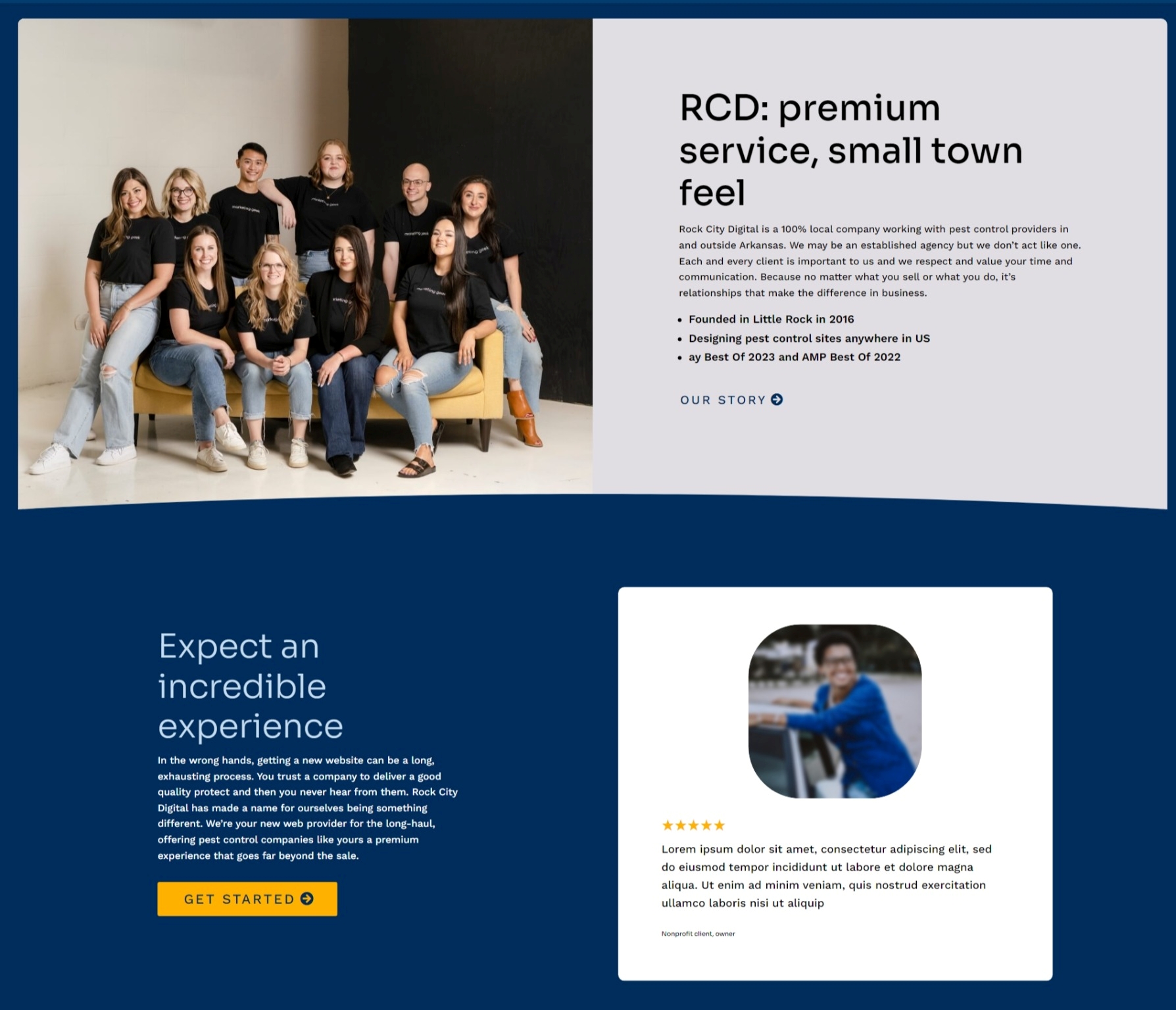
Headlines are in Sora
Subheaders are usually in DM Sans
But Sora in #355995 is a nice alternative sometimes
DM Sans is also used for paragraph text. 17px is a good starting size with 1.8em line height. When possible, avoid displaying paragraph text any smaller than this.
Work Sans Light can be used as a secondary paragraph text for disclaimers and small info. But you’ll use DM Sans most of the time.
Google Font links
Dividers
A great way to incorporate the yellow is as a curved section divider. If multiple dividers are present, only the first and last should be yellow; the others will be a more narrow blue ribbon.

Colors
#002D5C
Primary blue
#ffb100
RCD Gold

Gradient:
#2b87da | #002d5c
#e0dde3
Slate
#C6DDF0
Light blue
#355995
Rarely used: Secondary blue
#D5D2D7
Rarely used: Slate accent
Examples

I used Bebas for the headline, which isn’t officially part of the RCD brand but hey, rules are made to be broken haha


Guidelines
Elements in the design will generally have a small border radius
Headlines in all caps should have more letter spacing
Headline font weight on dark backgrounds can be lighter
Headlines will usually be black on white/slate backgrounds
Headlines on dark backgrounds can be light blue
In general, very light font weights should be avoided
In general, yellow should not be used for text
In general, text should not be placed on yellow
Sora should not be used in all caps
Note from Daniel